Hi, I’m Sutik!
I have 15+ years under my belt designing digital products and studying people’s behaviours when interacting with them. I am all about playfulness and collaborative exploration. I enjoy pushing boundaries and geeking out about new tools.

Check out my work
CortexAI (knowledge mgt. system)
Deloitte’s existing Knowledge Management System had become cumbersome and seldom used, despite the ever-growing need for an easy and quick way to access trending, market and coding data.
The brief was two-fold; making it easy to consume as well as upload data details, to encourage users to upload data often and without friction. We began with user research interviews, culminating in 3 major user journeys; executives, employees, data producers. With follow-up design thinking exercises we were able to identify pain points and specific features to tackle them.
Design phase needed to be carried out in a way so as to minimize transition pains when delivering to the development team off-shore. Figjam and Miro were heavily used to collaborate and keep track of the various design streams, as well as creating a component library for developers to build for future feature needs/adjustments without much design support.
Dashboard
App Design
FigJam
User Research


Lodging booking system
Among many projects in the span of 2 years working with Alterra, this redesign of their lodge booking system was the most impactful and challenging. A thorough audit and analysis of their legacy system revealed many areas of improvement as well as the challenge of incorporating 3 different property types to be accounted for across at least a dozen destinations.
The work began with multiple stakeholder interviews and user-flow mapping exercises, culminating in very detailed design wireframes that could be shared across several stakeholders to receive feedback and buy-in for the (sometimes drastic) changes proposed.
Principal was utilized to prototype features and interactions that were too complex to describe in design but were crucial to the success of this e-commerce platform. Components with multiple/complex states were wireframed and prototyped in detail with live content for developers to be able to match the back-end legacy features successfully.
Web Design
Prototyping
E-commerce
Ethnography


Ikon Pass e-commerce website
One of the biggest products from the Alterra Mountain Co. was their multi-destination IKON ski pass. This was a multi-faceted and highly complex product, wrought with design challenges; disguising the legacy fulfillment systems in place, presenting the multi-layered pricing structure in a simple and digestible format, and many other marketing requirements.
One of the major challenges was positioning and merchandising these NEW passes against the well-established resort passes that customers were used to. Another was comparing the various IKON passes, all the while subtly pushing towards the most expensive, all-inclusive pass.
A "War Room" was setup with hundreds of variations of each crucial page in the e-commerce flow, where designers and developers collaborated and iterated on ideas that were executable in the timeframe given. On launch day, the website brought in $5+ Million in revenue, doubling that within a few months.
Interaction Design
Responsive
E-commerce
User Testing


Customer account management system
Nutrien was overdue for a re-haul of their agriculture"loan" management system. Multiple time-zones and COVID restrictions required some creative collaboration using MS Teams, Miro and LucidChart, as well as a very tight AGILE production, facilitated by Jira.
Requirement gathering was done in Agile, with quick design delivery to test and verify deliverables with stakeholders. This close collaboration resulted in discoveries of inefficient existing business processes. High-fidelity design prototypes allowed several areas of business to visualize the final product. Design Systems were developed in Figma, using Nutrien's existing design language, to ensure all areas of the business carried a consistent feel.
There were several challenges engaging the right stakeholders in a business of this size, with some design decisions having legal implications. This meant constant course corrections, some resulting in entire sprint's worth of work being redesigned. With design systems, the rework was simplified, as updates to components could be made quickly and rolled out to all the designs instantly.
These design systems were implemented in Storybook to ensure developers could re-use as much of the code as possible without needing repeated design sign-off.
App Design
Design System
Prototyping
Interaction Design


Pay-at-pump mobile app
The oil giant’s first foray into mobile apps began with a 4-day RDL including both stakeholders and users, to quickly transform business goals into a usable and enticing feature set.
This began with a collaborative exercise to determine a “Golden Thread” for the titular user of the app. This thread outlined a detailed day-in-the-life storyboard of how the app would fit into and add value to this user’s life. These were then converted to screen-flows. These whiteboard sketches were approved by users in-session and translated into complete designs using Sketch. A clickable prototype was built in InVision for early user-testing.
Confluence and Jira were employed to establish and manage Epics/Sprints in order to break the feature set down into testable chunks of work. This allowed us to involve the stakeholders throughout the entire development lifecycle and keep scope creep to a minimum.
Rapid Design Labs
Google Sprint
App Design
User Testing


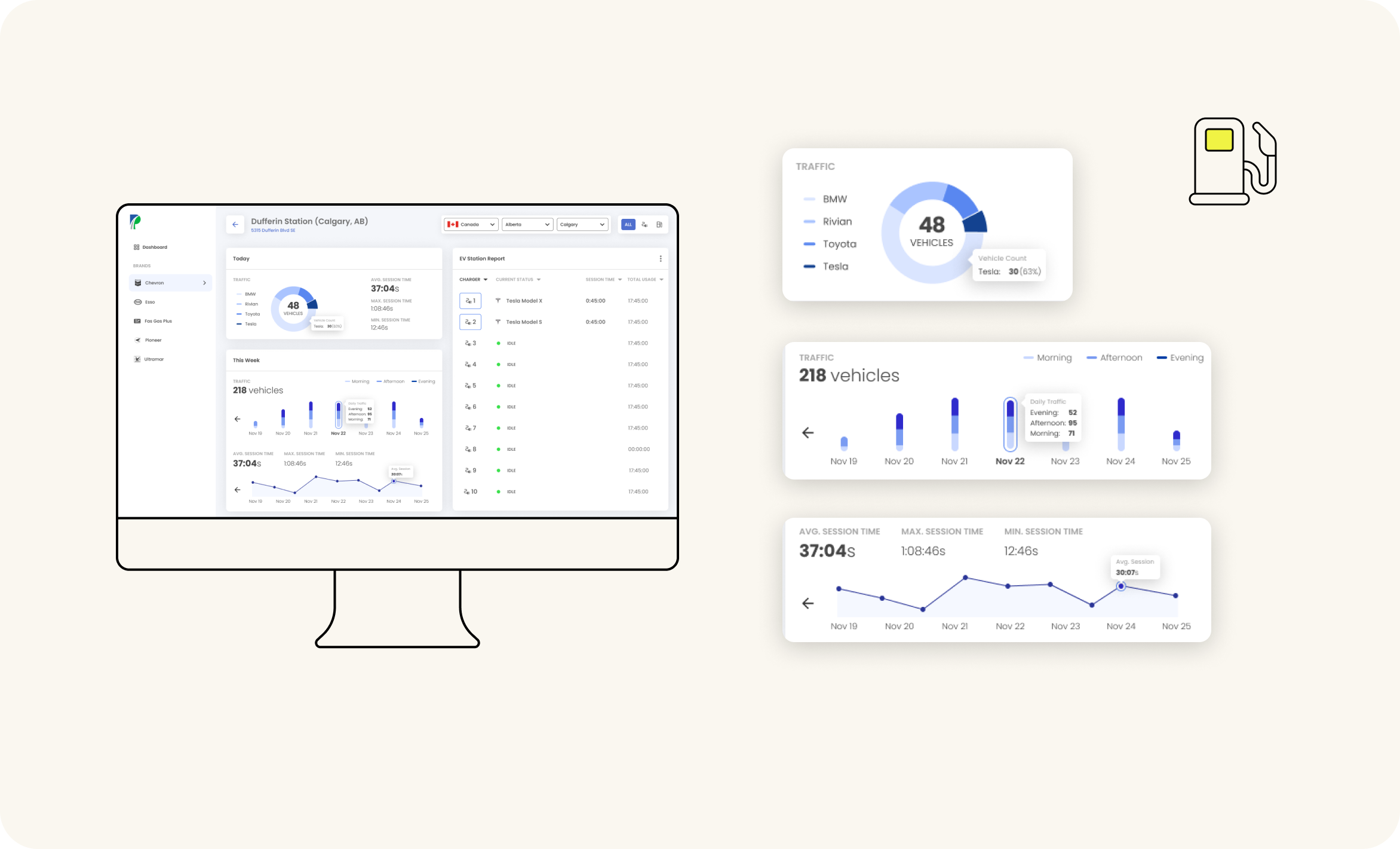
Station metric dashboard
The largest proprietor of gas stations in North America needed a way to track their new e-charging stations’ usage, to determine a strategy for targeted marketing to these customers that were spending more time at the station than their gasoline counterparts. Since this data was not forthcoming from manufacturers like Tesla, we decided to use Computer Vision technology to monitor and record traffic in and out of the gas stations.
For the purpose of setting up CV cameras and designing a dashboard that was effective, we visited some of Parkland’s gas stations and shadowed their managers to gain some ethnographic research. This was converted to an initial dashboard design, which was received so well by the client that they requested it to be expanded to monitor ALL traffic to their gas stations; electrical & gasoline. Additionally this dashboard needed to be robust enough to show data for all their affiliate station networks.
Dashboard
App Design
Product Design
User Research
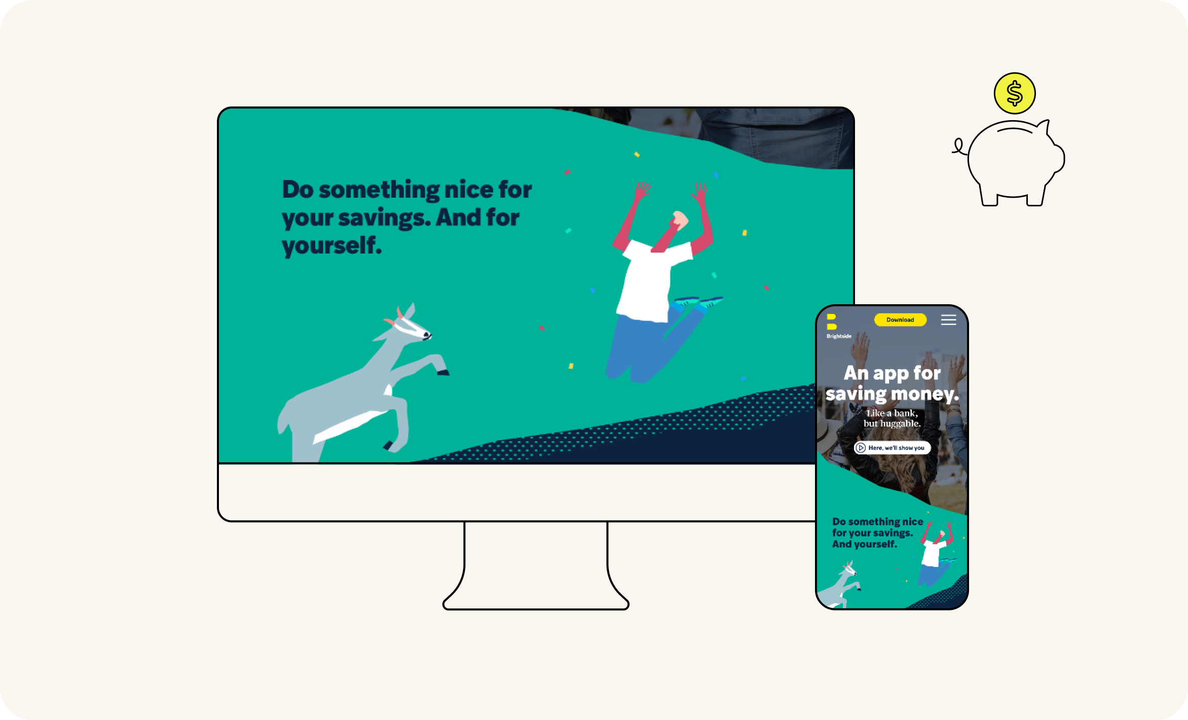
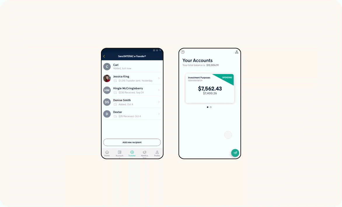
Brightside mobile-only banking app
An ambitious side project by ATB Financial to establish a digital-only bank, targeting young adults and millennials. The UI and design systems were continuously explored and updated in Sketch, focusing on a design language that de-mystifies and simplifies banking. Abstract was utilized to manage and collaborate on multiple features at a time across multiple teams, while maintaining consistency.
Principal was used to prototype and fine tune small features and interactions to test with focus groups regularly.
App Design
Interaction Design
Prototyping
Design System

E-commerce & flow optimization
The Calgary International Film Festival approached us with a new product/feature they wished to incorporate: “Access Passes”. They needed an audit of their current user-flow as well as a visual way to present the repercussions of introducing such a product, from browsing films to purchasing tickets. Since these passes were essentially an "Upsell", we also found opportunities within the user-flows where they would add value and could be effectively merchandized.
The solution was to split the userflows into three notable actions their users were performing, given the site’s existing IA, as well as a swath of user research.
We discovered that in order for the Access Passes to be effective, users needed a way to schedule multiple movies in the limited time CIFF runs. To do this we proposed a new calendar view where users could create a schedule for their CIFF experience without having to "swivel-chair" to avoid scheduling conflicts.
The checkout process was to be completely redesigned due to a business need to incorporate the new Access Passes in their website (as opposed to relying on a 3rd-party product), to give them more branding flexibility and capabilities.
E-commerce
Web Design
User Research
Journey Mapping


